
Welcome to Our Blog
Winning Business | Guiding Guests
This blog offers practical advice, smart insights, and thought-starters for anyone involved in helping visitors discover great experiences—whether you're trying to win business or guide your guests well. From brochures and maps to guides and digital screens, each piece draws on real-world experience and research to help you engage visitors more effectively.
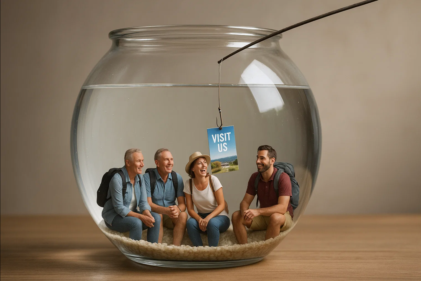
Be Smart. Go Fishing Where The Fish Are
Casting your message with precision, not hope, is the smarter way to hook visitors.

Poor Promotional Photos Will Unsell You. Here's how to Get Them Right
First impressions happen in seconds and are mostly visual. They win or lose you business.

Your Brochure’s Front Cover Determines Pick-up. Here's Our Design Tips.
No matter how good your visitor brochure is—if the front cover doesn’t connect, it may not be picked up and you lose.

How Brochures in Hotels Enhance Guest Experiences
Discover how a simple brochure display adds to guest experiences, boosts reviews, and brings visitors back—again and again.

Steal These Power Words—They Win You Business
Get inspired by Power Words that prompt visitors to act—on brochures, screens, and websites.

Why Advertising on Hotel Screens Is a Smart Move for Local Attractions
Hotel screens reach visitors when they’re most open to ideas—that’s a perfect moment for local attractions to be seen.

Distance Decay and its Impact on Your Business
Distance Decay is one of the most important principles for tourism-connected businesses to heed.
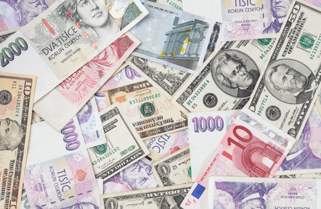
The Local and Global Economic Impact of Visitor Information
The powerful chain reaction set in motion every time a brochure is picked up.
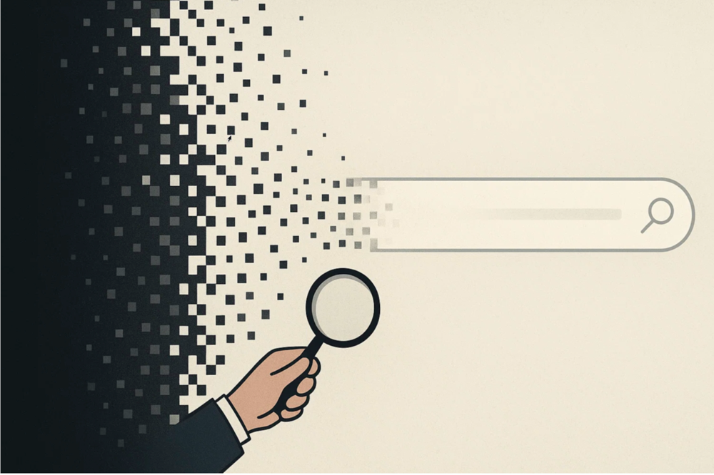
Vanishing Digital Search - Will You Be Found?
AI is changing how people find things. And it’s quietly pushing many businesses out of view.